
6 Web UI/UX Design Trends for 2026: Looking Good Isn't Enough Looking
Vy Tran
After exploring these trends, one thing stands out to me: a great website doesn’t need every shiny new feature. It needs to feel right for the people using it. Whether you choose bold colors, playful animations, or simple layouts, the best design makes people feel welcome, curious, and truly understood.
Ever landed on a website that looked absolutely stunning, with fancy animations and eye-catching visuals, but somehow couldn't find the checkout button?
Yep, we've all been there.
That's exactly why web UI/UX design in 2026 is about more than just making things look pretty. It's about creating websites that people actually enjoy using.
Drawing insights from Figma, Nielsen Norman Group, and research on website accessibility and performance, we've rounded up six web design trends for 2026 worth knowing about.
Let's see what's changing and why it matters.
1AI-Powered Experiences That Feel Like Helpful Conversations
We've all landed on a website, searched for something simple, and ended up clicking through five different pages. AI-powered interfaces are trying to change that. Instead of forcing visitors to figure everything out themselves, websites can offer conversational search, smarter recommendations, and assistants that guide people toward the right information.
Imagine visiting a travel website and typing, “I want a quiet weekend near the beach.” A helpful assistant could suggest relevant stays, explain the differences, and help narrow your options. That's a much friendlier experience than digging through endless filters, and it reflects the direction highlighted in Figma's 2026 web design trends.
Still, good AI-powered website design isn't about putting a chatbot on every page. The best experiences make help optional, explain what's happening, and respect people's privacy. AI should remove extra work, not create another pop-up to close.
22. Bold Visual Identities That Feel More Human
Here's the funny thing about having more design tools than ever: websites can start looking surprisingly similar. That's why distinctive colors, oversized typography, custom illustrations, and even slightly imperfect, handmade details are getting attention. They give visitors something to remember beyond a familiar template.
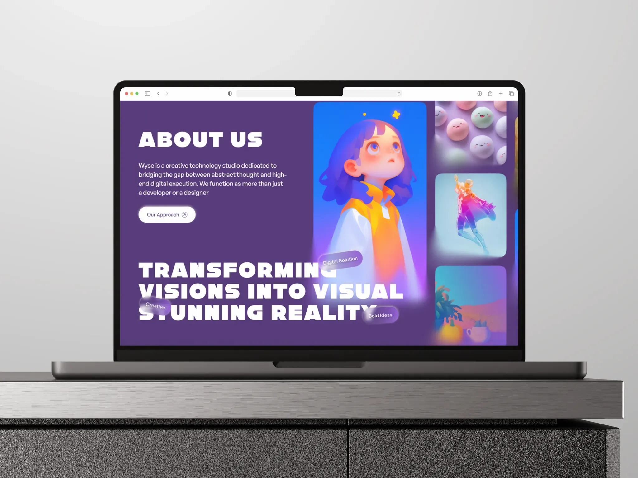
Webflow's 2026 trend roundup points to brands developing their own visual styles and mixing traditional art with modern interfaces. Think playful lettering paired with clean navigation, or expressive photography surrounded by generous space. A website can have personality without becoming a chaotic collage.
For brands, this is a reminder that modern website design doesn't have one correct look. A bright, rebellious palette might be perfect for a creative studio, while warmer colors and thoughtful illustrations might suit a wellness brand. The trick is to make the visuals sound like you while keeping the important buttons and messages easy to spot.
33. Motion and 3D Elements With an Actual Purpose
A little movement can make a website feel alive. Picture a button gently responding when you click it, a product turning so you can see every side, or an animation showing how a service works. These small touches, often called microinteractions, can make an interface easier to understand as well as more fun.
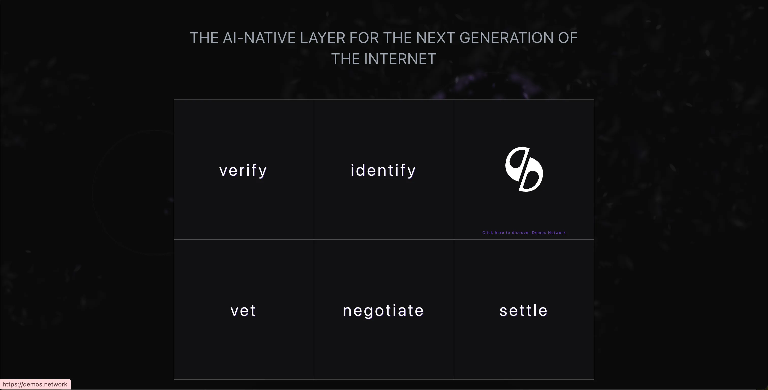
Figma highlights immersive 3D and motion design among its 2026 trends, and there's plenty of creative room to explore. But more animation isn't automatically better UX. A spinning object is useful if it helps someone examine a product; it's less useful if it delays the information they came to find.
The sweet spot is movement that guides rather than distracts. Keep it light enough for mobile devices, avoid effects that slow the page down, and let visitors reduce unnecessary animation. Good interactive website design should feel like a helpful nudge, not a theme park ride you can't leave.
44. Clearer Content, Smarter Navigation, Less Guesswork
Ever opened a services page and thought, “Okay, but what do you actually do?” You're not alone. In 2026, clear website copy, quick summaries, and guided scrolling are becoming valuable ways to help busy visitors find the point before they lose interest.
Webflow calls out both the “TL;DR experience” and guided scrolling in its 2026 predictions. That could mean an overview near the top of a page, clear section headings, or a simple progress indicator during a longer story. Visitors get the big picture first, then decide whether to explore the details.
This is where user experience design can make a quiet but powerful difference. Keep navigation labels familiar, write headings that answer real questions, and make the next step obvious. A little creativity is welcome, but nobody should need a treasure map to find your contact page. For more on the fundamentals, explore our guide to why UI/UX design matters.
55. Accessibility Becomes Part of the Design, Not an Afterthought
An attractive website isn't much use if people struggle to read it, navigate it, or click its buttons. That's why accessible website design deserves a place in every conversation about 2026 trends. It means designing for people with different abilities, devices, and ways of using the web from the start.
The W3C's WCAG 2.2 guidelines cover essentials such as usable controls, keyboard access, readable content, and accessible forms. In practice, that might mean strong color contrast, captions for videos, descriptive text for meaningful images, and buttons that are comfortable to tap. These choices often make a website easier for everyone, not only visitors with disabilities.
Accessibility also fits naturally with the other trends on this list. Bold typography still needs to be readable, and interactive experiences still need alternatives for people who prefer less motion. An inclusive website isn't a less creative one; it's a website that invites more people in.
66. Mobile-First Design Meets Faster, Lighter Websites
We might dream up website ideas on big monitors, but plenty of visitors will experience them on a phone. Mobile-first website design starts with that smaller screen: what's most important, what should appear first, and what can we simplify? It's a practical way to create a better experience across devices. Our guide to mobile-friendly website design explores this approach in more detail.
There's still work to do. In Baymard Institute's 2026 mobile UX benchmark, 75% of the reviewed ecommerce mobile sites scored “mediocre” for user experience. Even established brands can make everyday tasks harder than they need to be, from opening menus to comparing products.
Speed matters just as much as layout. Google's Core Web Vitals focus on loading speed, responsiveness, and visual stability—in plain English, pages should appear quickly, react promptly, and stop jumping around while you read. Optimized images, simpler layouts, and fewer unnecessary effects support both website performance and a smoother browsing experience.
7So, Which 2026 Trend Should You Try First?
The fun part about web UI/UX design in 2026 is that you don't have to adopt every trend to build something better. Start with the people visiting your website. What are they trying to do, where are they getting stuck, and what would make their next step feel effortless?
Maybe the answer is clearer navigation, not a 3D animation. Maybe it's a more memorable visual identity, or a mobile experience that finally feels smooth. At RoseRebel, we believe the best digital experiences find a balance between standing out and making things simple. Trends come and go, but a website that genuinely works for people is always a good look.