From Figma to a Live Website: A Developer Handoff Checklist for Agencies
UI/UX Design

Last updated November 17, 2026
The homepage is approved. The client likes the design. Every desktop frame looks polished.
Then development begins.
The mobile navigation has no defined behavior. The contact form shows a default state but no validation errors. Card titles are all the same length in Figma, while the CMS will accept anything an editor types. The animation looks clear in a prototype, but nobody has documented its timing or what should happen when a visitor prefers reduced motion.
These gaps turn a seemingly finished design into a series of decisions made during development. Each decision adds a message, a meeting, or a round of rework.
A complete Figma design handoff to developers includes the approved screens, reusable rules, responsive behavior, interaction states, real content constraints, assets, and acceptance criteria needed to build the website. It also gives the agency a clear way to review the implementation before the client sees it.
This checklist is written for creative agencies, UX/UI studios, and marketing teams handing a website to an internal or external development partner.
1What Does a Complete Figma Handoff Include?
A handoff is the point at which an approved design becomes an implementation brief.
Developers need more than a collection of finished screens. They need to understand the system behind those screens: which elements repeat, how layouts change, what users can do, where content comes from, and how the team will decide whether the build is correct.
A practical handoff package normally contains:
- A clearly identified source of truth in Figma
- Approved desktop and mobile designs for the agreed scope
- Components, styles, variables, and their intended use
- Responsive rules for content between the supplied screen sizes
- Interaction, form, loading, empty, error, and success states
- Production copy or documented content limits
- Export-ready images, icons, fonts, and other assets
- Accessibility requirements that affect design and behavior
- CMS, API, analytics, SEO, and integration requirements
- Acceptance criteria and a design QA process
Figma's own handoff guidance recommends descriptive page names, organized sections, documented components, export settings, and a clear “Ready for development” status. It also calls out variants, states, accessibility, contrast, and responsive values as information developers may need. See Figma's developer handoff guidance.
The file does not need to document every CSS property. It should remove ambiguity from the decisions that matter to the experience.
2The 12-Point Figma Design Handoff Checklist
1. Confirm the approved scope and source of truth
Start with one question: which frames should the developer build?
Create a dedicated handoff page or section containing only approved work. Label explorations, rejected directions, and archived versions so they cannot be mistaken for current designs. Record the approval date or version, especially when several stakeholders review the file.
Include a simple list of pages and templates in scope. Ten website pages may use only four layouts, while a six-page campaign site may contain six unique experiences. Development estimates depend more on components, layouts, behavior, and integrations than the raw page count.
Before development starts, confirm:
- The approved page list and reusable templates
- The Figma page or branch developers should inspect
- The latest approved version
- Features and integrations included in the build
- Items intentionally postponed to a later phase
- The person authorized to approve design changes
If a requirement is still open, mark it as open. An honest gap is easier to plan around than a decision hidden inside an apparently final screen.
2. Organize the file for someone who did not design it
A developer should be able to open the file and find the homepage, page templates, component library, and notes without a guided tour.
Use descriptive names for pages, sections, frames, layers, and components. Group related screens in a sensible reading order. Separate the design system from final page layouts, and keep archived concepts outside the handoff area.
A straightforward file structure might look like this:
- 00 Cover and project notes
- 01 Foundations
- 02 Components
- 03 Desktop pages
- 04 Mobile pages
- 05 Flows and interactions
- 06 Ready for development
- 99 Archive
The exact labels matter less than consistency. If the file uses status markers, define them once so everyone knows the difference between “in progress,” “review,” and “approved.”
3. Turn repeated visual decisions into components and tokens
Developers build systems, even when the final output looks like a set of pages.
If the same button appears in fifteen places, it should usually map to one reusable component with documented variants. The same principle applies to cards, navigation items, form fields, accordions, content blocks, and modal windows.
Define the foundations that repeat across the website:
| Foundation | What to hand over |
|---|---|
| Colour | Named brand, text, surface, border, feedback, and state colours |
| Typography | Font files or licenses, type styles, weights, line heights, and usage |
| Spacing | A spacing scale or clear layout rules |
| Grid | Container widths, columns, gutters, and page margins |
| Radius and elevation | Reusable values and where they apply |
| Components | Variants, properties, states, and usage notes |
Avoid naming a colour Blue 3 if its role is Text/Link/Default. Role-based names help designers and developers discuss the same thing when the palette changes.
Perfect one-to-one parity between Figma and the codebase is not always practical. The goal is a shared model that prevents each page from becoming a separate interpretation.
4. Document the behavior between screen sizes
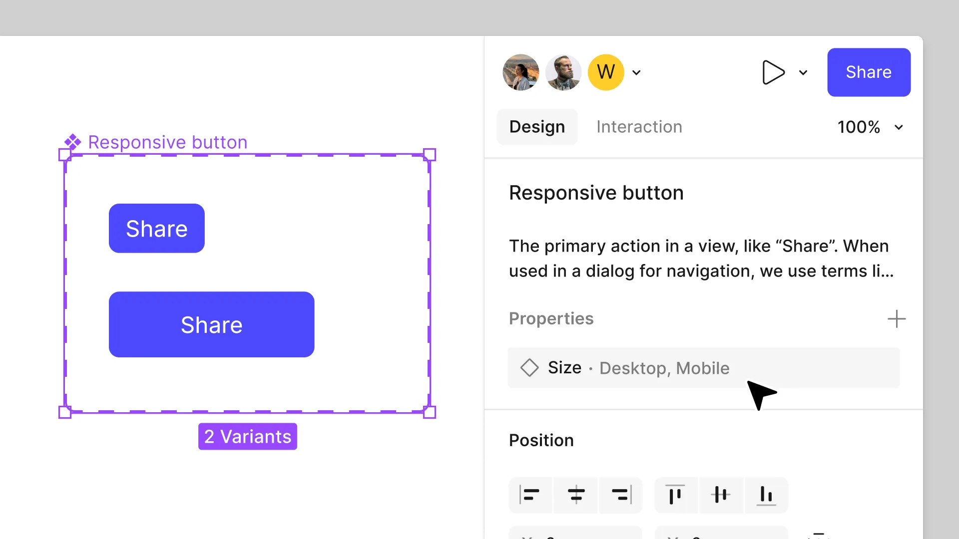
A desktop frame and a mobile frame show two outcomes. They do not explain everything that happens between them.
For each major layout, state:
- Which widths or content conditions trigger a change
- Whether columns stack, wrap, scroll, or disappear
- How navigation changes on smaller screens
- Which values are fixed, fluid, minimum, or maximum
- How images crop and where the focal point sits
- What happens to wide tables, carousels, and embedded content
- Which elements change order
- How long headings and translated text wrap
Choose breakpoints because the content needs them, then test the implementation across a range of viewport widths. A layout can work at the two widths shown in Figma and still fail at 820 pixels.
Google's responsive design guidance recommends sizing content to the viewport and testing layouts across breakpoints. It also notes that image dimensions help browsers reserve space before files load, which can reduce layout shifts.
5. Design the states users will actually encounter
The default state is only one moment in a working interface.
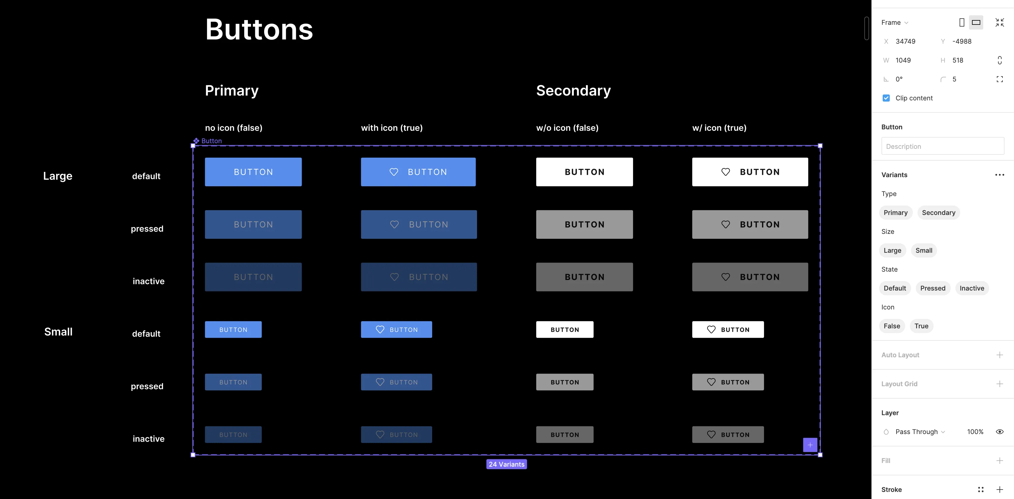
Buttons may need default, hover, focus, pressed, loading, and disabled states. Forms need clear rules for validation, error messages, and successful submission. Content modules may need empty states or fallbacks when an image is missing.
Review the relevant states for each component:
- Default
- Hover and focus
- Selected or active
- Disabled
- Loading or processing
- Empty or no results
- Error and recovery
- Success or confirmation
- Long content and overflow
- Missing image or unavailable data
- Logged-in, logged-out, or permission-based views where relevant
Do not create states that the product will never use. Cover the paths supported by the real website and its integrations.
Forms deserve extra attention. Specify required fields, input formats, inline validation, server errors, successful submission, and what happens after success. “Thank you” may mean an inline message, a new page, a CRM event, or a download. The developer should not have to choose on launch day.
6. Replace perfect placeholder copy with production conditions
Designs often look stable because every card title fits on two lines and every team member has a portrait with the same proportions.
The live CMS will be less orderly.
Use final copy where possible. When it is not ready, provide content rules that reflect the intended system:
- Recommended and maximum heading lengths
- Excerpt limits and truncation behavior
- Required and optional fields
- Image aspect ratios and minimum dimensions
- Supported video or embed formats
- Rules for missing content
- Language expansion for multilingual websites
- Sample content at the shortest and longest expected lengths
Test one card with a short title and another with a long one. Test a page with no related posts. Test a portrait image in a landscape slot. These examples expose layout assumptions before they reach production.
For CMS-driven projects, align the Figma components with the content model. If editors need three promotion types, show those three types and define the fields each one needs.
7. Specify interactions and motion in plain language
A prototype can demonstrate sequence, but it may not communicate the exact behavior a developer needs to reproduce.
For meaningful interactions, document:
- What triggers the action
- Which element changes
- The start and end states
- Duration and easing when they matter
- Whether the motion repeats
- Scroll, hover, click, keyboard, and touch behavior
- What happens on devices that do not support hover
- The reduced-motion alternative
Use short annotations beside the relevant frame. For example: “On desktop, the image scales from 1.00 to 1.04 over 240 ms when the card is hovered. On touch devices, keep the image at 1.00.”
Complex storytelling, 3D elements, games, and scroll-linked animation should be reviewed with developers before visual approval. Early feasibility input can protect the creative idea while there is still room to adjust the approach.
8. Prepare production-ready assets
Mark every asset that developers should export and provide the correct format.
As a starting point:
- Use SVG for suitable icons and vector artwork
- Provide raster images at appropriate dimensions and quality
- Confirm whether photography can be cropped
- Identify the focal point for responsive crops
- Supply licensed font files and allowed web weights
- Remove hidden layers and obsolete exports
- Use descriptive filenames instead of image-final-2.png
- Note which images are meaningful and which are decorative
Large images can become a major part of page weight. Export settings should balance visual quality with the way the asset will appear in the interface.
Google recommends responsive image techniques, descriptive filenames, and useful alt text for meaningful images. It also warns against keyword stuffing in alt attributes. Review Google's image SEO guidance when preparing website imagery.
Alt text itself belongs in the content workflow, not inside the image file. The design handoff should make clear who will write it and where editors will manage it.
9. Carry accessibility decisions into development
Accessibility is easier to preserve when the design file shows the intended behavior.
At minimum, document:
- Heading hierarchy and landmark intent
- Text and interface contrast requirements
- Visible keyboard focus states
- Logical focus order for menus, modals, and forms
- Labels, instructions, and error messages
- Touch-target expectations
- Captions or transcripts for media
- Reduced-motion behavior
- Information currently communicated only by colour
A visual label and a programmatic accessible name also need to agree. The Web Content Accessibility Guidelines 2.2 cover focus visibility, label naming, target size, keyboard access, contrast, and other requirements that influence both design and implementation.
Figma cannot prove that the final website is accessible. The built interface still needs keyboard, screen-reader, zoom, contrast, and automated checks appropriate to the project.
10. Add CMS, data, SEO, analytics, and integration notes
Many interface decisions depend on systems outside Figma.
A careers page may pull vacancies from an API. A resource library may need filters and pagination. A lead form may send data to a CRM, trigger an email, and record an analytics event. A multilingual website may need locale-specific navigation and content fields.
For each dynamic feature, identify:
- The system that supplies or receives the data
- Available fields and their formats
- Required, optional, and conditional fields
- Sorting, filtering, pagination, and search rules
- Loading, empty, error, and retry behavior
- Privacy or consent requirements
- Analytics events and meaningful conversion actions
- Editable SEO fields such as title, description, canonical URL, and image
- Redirect or migration requirements for an existing website
Designs should respect the data that actually exists. A card cannot display an author role if the API does not return one. Resolve these mismatches before the component is treated as approved.
11. Write acceptance criteria and plan design QA
“Build it like the Figma” is difficult to test.
Acceptance criteria turn visual intent into reviewable outcomes. They can cover page behavior, supported browsers, responsive layouts, CMS editing, form delivery, analytics, accessibility, performance, and content migration.
For a responsive navigation, the criteria might state:
- Desktop navigation displays the approved links and dropdown behavior.
- Mobile navigation opens and closes by touch and keyboard.
- Focus moves into the open menu and returns to the trigger when it closes.
- The menu works with long link labels and a two-line item.
- The current page is visually identified.
Agree on review stages before the build begins:
- Component review
- First page or representative template review
- Responsive and interaction review
- Content and integration review
- Pre-launch QA
Early reviews catch systemic problems. If every card uses the wrong spacing or every heading uses the wrong weight, fix the component before thirty pages inherit the same issue.
12. Hold a live walkthrough and control changes
Even a disciplined file benefits from a short handoff meeting.
Walk developers through the business goal, page types, components, responsive rules, interactions, content sources, known risks, and unresolved questions. Invite technical challenges during the meeting. A developer may see a reusable pattern, API constraint, performance risk, or browser issue that the design team cannot see from the frames alone.
After the walkthrough, record decisions in one shared place. Define how design changes will be proposed, approved, and reflected in both Figma and the build.
This matters when an external team is involved. A white-label partner may work behind the scenes or join technical meetings with the agency. The communication model should be agreed before development begins. Our guide to white-label web development for agencies explains the main delivery models and responsibilities.
3Who Owns What During Design-to-Development Handoff?
Handoff works better when responsibilities are explicit. The following model is a starting point, not a universal rule.
| Decision or deliverable | Agency or design team | Development partner | Shared |
|---|---|---|---|
| Approved visual direction | ✓ | ||
| Final copy and content ownership | ✓ | ||
| Component and responsive intent | ✓ | ✓ | |
| Technical feasibility | ✓ | ✓ | |
| CMS and integration architecture | ✓ | ✓ | |
| Implementation details | ✓ | ||
| Accessibility requirements | ✓ | ||
| Design QA | ✓ | ✓ | |
| Functional and technical QA | ✓ | ✓ | |
| Client approval | ✓ | ||
| Deployment and handover | ✓ | ✓ |
The agency should retain control of the client relationship and creative approval when that is part of the engagement. The development team should have enough access to question requirements and flag technical risks.
RoseRebel worked this way during the Orient Software website rebuild. Orient supplied the UI designs, while RoseRebel handled the Next.js frontend, headless WordPress implementation, API integrations, content migration, Azure deployment, and QA. The project included nearly 30 layouts and approximately 1,000 migrated URLs, so coordination extended well beyond exporting assets from Figma.
4Common Figma Handoff Gaps and What They Affect
| Handoff gap | What happens during development | Better handoff |
|---|---|---|
| Only desktop screens | Mobile behavior is interpreted late | Supply mobile designs and responsive rules |
| Default states only | Errors, loading, and focus look inconsistent | Document the states the real flow needs |
| Placeholder copy | CMS content breaks cards and page rhythm | Test realistic short, long, and missing content |
| Detached screens | Repeated patterns are coded differently | Define components and variants |
| Prototype without notes | Timing and fallback behavior remain unclear | Annotate triggers, outcomes, motion, and input methods |
| Unmarked draft frames | Developers build an outdated direction | Create one approved handoff area |
| Assets without export settings | Images arrive in the wrong format or size | Mark exports and supply production files |
| No acceptance criteria | Review becomes subjective and repetitive | Agree on testable outcomes and checkpoints |
| No CMS or API context | The design conflicts with available data | Review the content model and integrations early |
5Does AI Remove the Need for a Developer Handoff?
AI-assisted design and coding tools can inspect frames, generate components, suggest code, and reduce some repetitive implementation work. They still need the same project decisions a human developer needs.
A generated component cannot know whether a card title may contain 40 or 140 characters unless the content rules say so. It cannot choose the correct keyboard behavior for a custom menu from a static image. It cannot infer who owns a CRM integration, which analytics event counts as a lead, or whether an animation is acceptable on mobile.
Figma describes Dev Mode, Code Connect, and its development integrations as ways to connect design context with implementation. The input still benefits from named components, variables, states, annotations, and approved frames. See Figma's design handoff overview.
Treat generated code as implementation support. Review it against the project's architecture, accessibility requirements, browser support, content model, performance needs, and acceptance criteria before it reaches production.
6A Short Pre-Handoff Review
Before the development team begins, confirm that you can answer each item below.
We have one approved source of truth.
Every page and template in scope is listed.
Repeated interface patterns use documented components.
Desktop, mobile, and in-between behavior is clear.
Interactive components include the states they need.
Content rules cover long, short, missing, and dynamic data.
Interactions and motion have written behavior notes.
Production assets and font rights are ready.
Accessibility requirements are visible in the design and brief.
CMS, API, SEO, analytics, and migration needs are documented.
Acceptance criteria and review checkpoints are agreed.
Open questions have owners and deadlines.
If several boxes remain open, the project may still be ready for technical discovery. It is probably not ready for a fixed implementation estimate.
7Frequently Asked Questions
What should be included in a Figma handoff to developers?
Include the approved screens, reusable components, styles or variables, responsive rules, interaction states, content constraints, export-ready assets, accessibility notes, system requirements, and acceptance criteria. Give developers one clearly marked source of truth.
Do developers need Figma Dev Mode?
Dev Mode can make inspection, measurements, variables, assets, annotations, and ready-for-development work easier to access. A team can still complete a handoff without it if the necessary information is documented and accessible through the tools available to both sides.
Should every breakpoint be designed in Figma?
You do not need a frame for every possible width. Supply representative desktop and mobile designs, add tablet or intermediate views where the layout changes substantially, and document the rules that govern widths between the supplied frames.
Who is responsible for responsive design?
The designer owns the intended hierarchy and behavior. The developer owns a stable implementation across supported devices and browsers. Responsive decisions should be reviewed together when content, performance, or technical constraints affect the design.
When should developers review a website design?
Bring developers into the project before final visual approval when the website includes complex animation, custom interactions, third-party integrations, a headless CMS, large-scale migration, or demanding performance requirements. Early technical input reduces the cost of changing an approach.
Can a development partner work directly from our agency's Figma files?
Yes. Agree on file access, approved frames, communication, client contact, review stages, confidentiality, and ownership before work begins. A short technical discovery is useful when the design includes unresolved behavior or integrations.
8Bring Development Into the Project Before the Final Export
A strong handoff protects the design after implementation starts. It gives developers enough context to build a coherent system and gives the agency a practical standard for reviewing the work.
RoseRebel supports agencies with technical consultation, frontend and backend development, CMS implementation, API integration, QA, deployment, and post-launch maintenance. We can work behind the scenes or join approved project meetings as an embedded technical team.
Discuss a development partnership or review our website development work.
About the author: RoseRebel Digital is a Vietnam-based boutique digital studio combining strategy, design, and engineering to build websites, applications, and digital platforms.
Further Reading
- Figma: Optimize design files for developer handoff
- Figma: The designer's handbook for developer handoff
- web.dev: Responsive web design basics
- W3C: Web Content Accessibility Guidelines 2.2
- Google Search Central: Image SEO best practices